Toronto's Accessibility Challenge

I love this city. I have had to “get used to” every city I’ve lived in, including the one I grew up in. I felt at home the moment I arrived to Toronto.
That is why I am deeply disappointed by one huge omission in the whole city: Accessible pedestrian traffic lights for the blind.
Let’s take a walk…
City of Toronto has a very thorough “Accessibility Design Guidelines” documentation dating all the way back to 2004, with amendments made throughout 2017 by additional documents. So the thought is there.
But when accessibility is in question, it is not the thought that counts. The thought needs enforcement.
…in Istanbul
I -intermittently- grew up in this city. There are many, many things wrong with the city and its planning, though credit where credit is due: They have the best pedestrian crossing signals I have seen and heard.
Here is a breakdown of this set of lights:
- The button is already pressed, and a voice says “Please Wait” continually. (When it is not pressed, a loud beeping noise lets one know where the crossing and the button is without annoying anyone.)
- 00:08 The side of the button shows where the light is, which way it is meant for, and includes the number of lanes to be crossed.
Beneath, it says “İBB Trafik Müd. Tel: 444 4154”, mentioning the city department responsible of this light and its phone number, in Braille. - 01:09 The spoken voice changes to “You can cross the street now” as the light turns green. You can hear it even from the middle of the street.
- 01:19 The voice starts counting down from 5 as the light starts blinking red.
- 01:25 The clicking sound returns as the light turns solid red.
- 01:44 My girlfriend presses the button, to show that it has a solid and loud feedback, and that the spoken notice returns.1
…and in Toronto
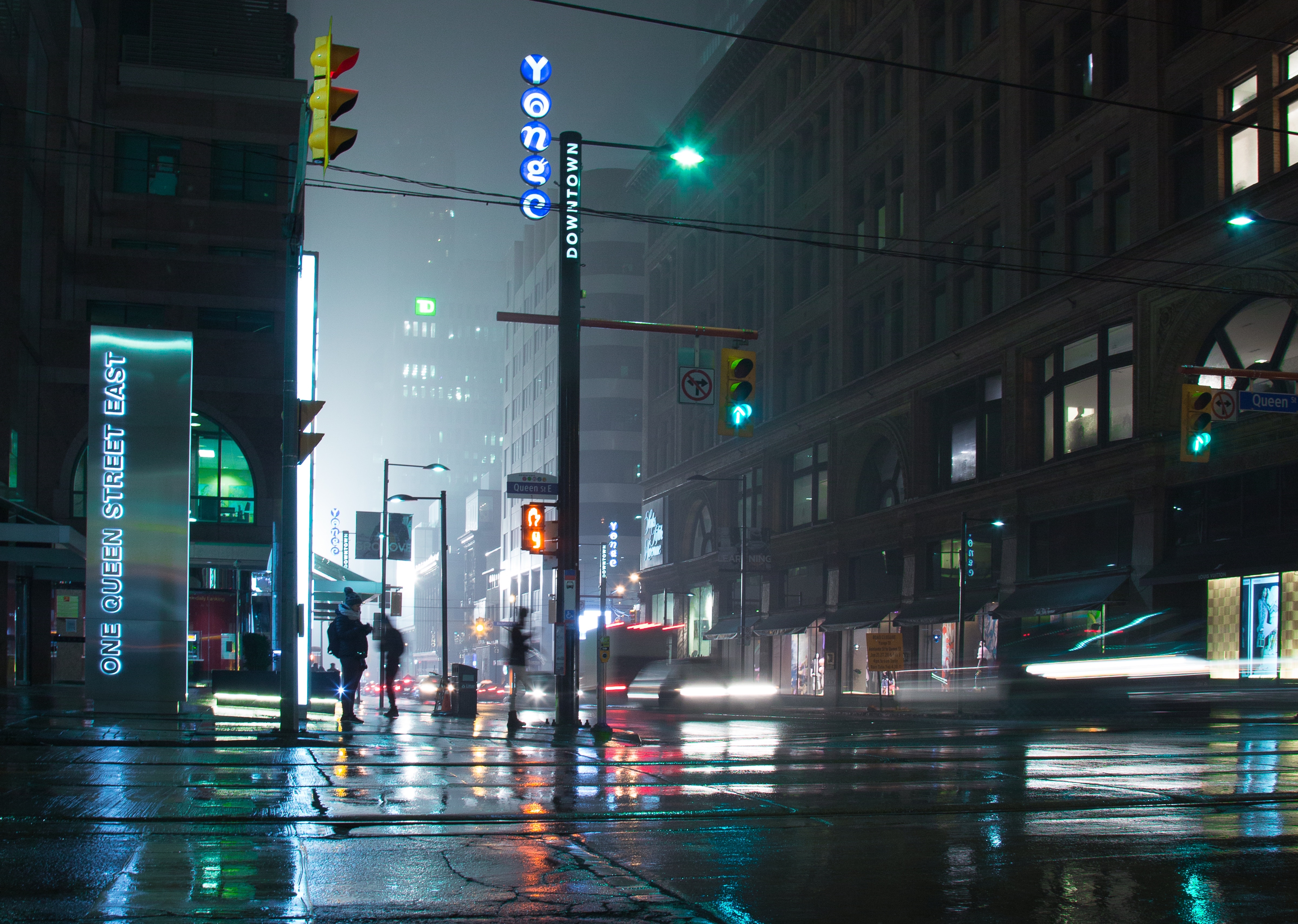
The situation with the Toronto traffic lights was the first thing I noticed, and was disappointed in.
In contrast, there isn’t much to show for Toronto
- The beeping sound is much lower2 than the ones in Istanbul.
- The sound also does not change, whether the light is green or red, and gives no audio feedback about the situation.
- When pressed, the feedback sound is not different from the regular beeping.
- There is no information for blind people. None. Not even a phone number.
Is it really that bad?
The city seems to have made great efforts to be accessible, however most of that effort seems to have gone into mobility impairments rather than sensory impairments.
The city says there are 845 signalized intersections, and more will come in 2018, but I have not run into a single one as capable as the ones in Istanbul. I live in midtown, and spend a lot of time in downtown; all the lights I’ve come across are like the ones in the video above.
A beacon of hope?
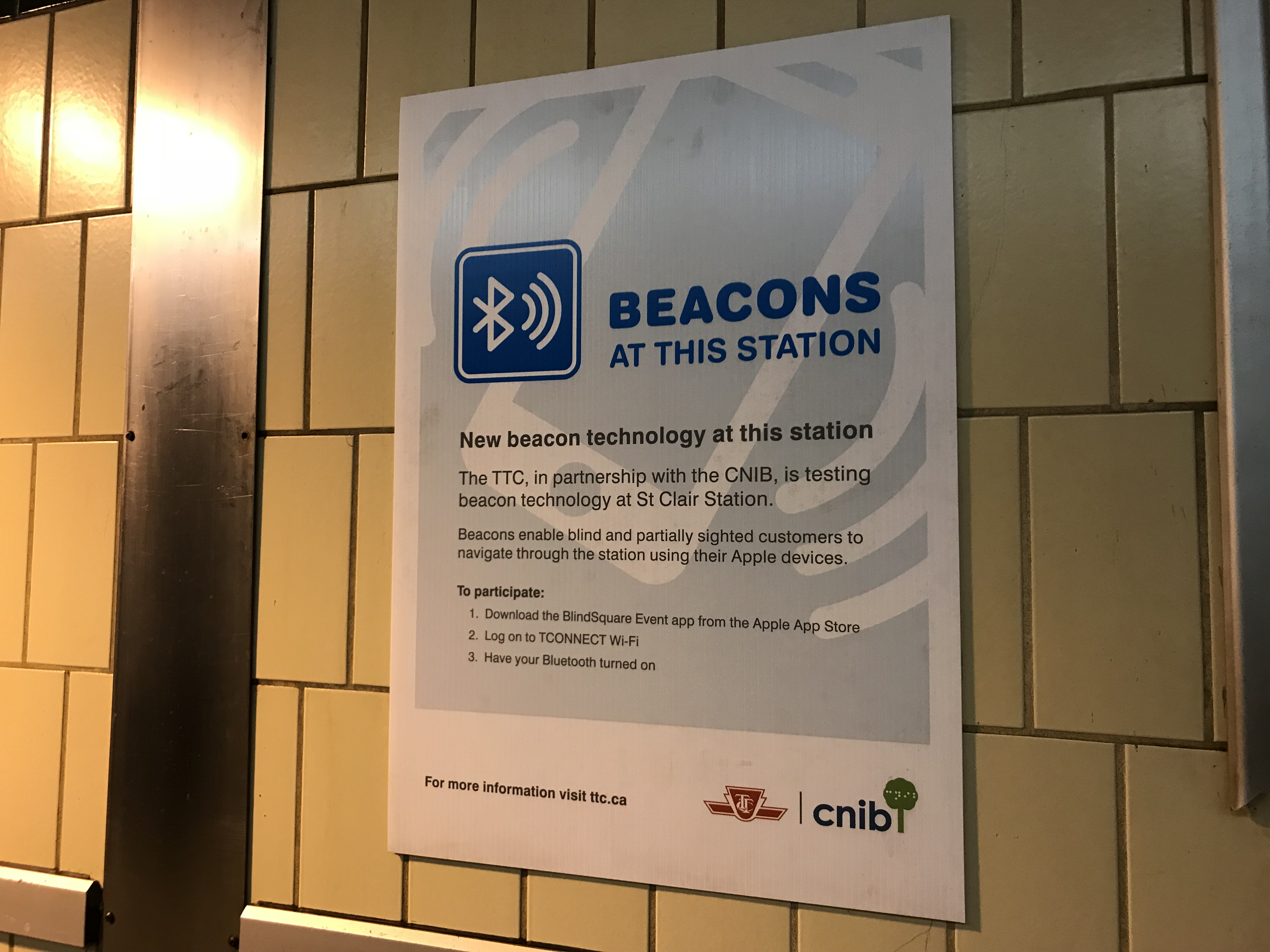
There are initiatives to try out newer things for accessibility, like the Beacon technology used at a few stations for audio guidance. Good intentions mixed with bad execution again, though.

I just hope they circle back to inclusivity, and find the quick wins that are readily implemented elsewhere. It is OK to copy and cheat, especially when it helps people.