Post-mortem of an unreleased side project
I finally had a purpose. I knew exactly what business I wanted to build, and I knew exactly what side project I wanted to create. It was all very clear.
Then—points around, arms flailing—this happened.
I surely had to alter some of my plans.
This is the story of how I came up with my side project, ComeOver.ca… and how I let it go.
Part 1: Get a clue, form an idea
Counting days is a requirement for Canadian PR (permanent residency) holders. They need it to renew their PR cards, apply for citizenship, and even activate their health insurance plans.
It isn’t made abundantly clear though. Up until very recently, there was no “travel journal” included within a PR card. No warnings in bold letters to make sure one keeps track.
One had to actively search for caveats and find the rules, or—as it usually happened—be told about them while trying to take one of the aforementioned actions. I’ve heard too many stories about hair-pulling, stress-inducing times people went through to gather the correct data in a short time.
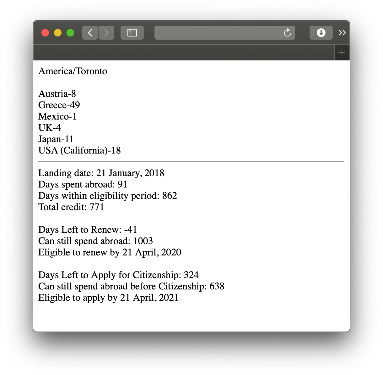
I, being a mildly paranoid and highly skeptical person1, was ready from the start though. I had created a simple tool that I used for myself and my girlfriend, an Airtable sheet and a PHP app I cobbled together on Glitch, which gradually became a viably publicizable project.

Part 2: Geeking Out Over Details
I’m a product designer. I’ve designed countless apps, for native platforms as well as the web. I know what it takes to create iOS, Android, and web apps.
I also knew that my engineering strengths lay in web-native languages—HTML, CSS, and PHP—and I would have a hard time engineering an mobile-native app by myself.
So I decided to go the hybrid route.

I used Tailwind CSS to create a mockup. I created a fully-accesible UI, focused on a mobile-only layout, with custom CSS sprinkled to create a custom <details> disclosure element and some animation related to it.
I used Laravel, a PHP framework, to create the app. I developed and deployed initial builds with SQLite, which I might’ve even used for initial launch.
I also used Turbolinks2, not only because it made the app more reactive, but also because I intended to use Turbolinks iOS to package my app for the App Store.
Privacy-first means less data
I meant to create an app that created value to its users, not to its builders. If I were to create a native app, I wouldn’t have had any data leave the device in the first place, but opting for the web-based backend approach meant that I had to host the database that kept everyones secrets.
What I could design into the architecture was a minimization of data creep risk.
1. Know less.
I was not going to use analytics. The whole app—essentially—was a form and a table; users would have had no place to go that I needed to keep track of. Not having analytics would mean one less vector for data leak.
2. Randomize info.
Do I need an email address? Only if the user wants to use it for password recovery. For a login, username would do.
Do I need a name? Age? Photo? Absolutely not.
Do I get to compile an end-of-year report of “where people have been”? It’s not my data to do so, and I can make it even harder to collect by having freeform text fields that the user can fill in any way they desire—even perhaps in Igpay Atinlay.
3. Get consent.
Have an active open feedback line—especially for bugs. If a user comes with a calculation bug, get their data by having them actively select an option which dumps all their dates into a file, sans the names and notes, so the date data remains debuggable yet anonymous.
Part 3: Side project of a side project?
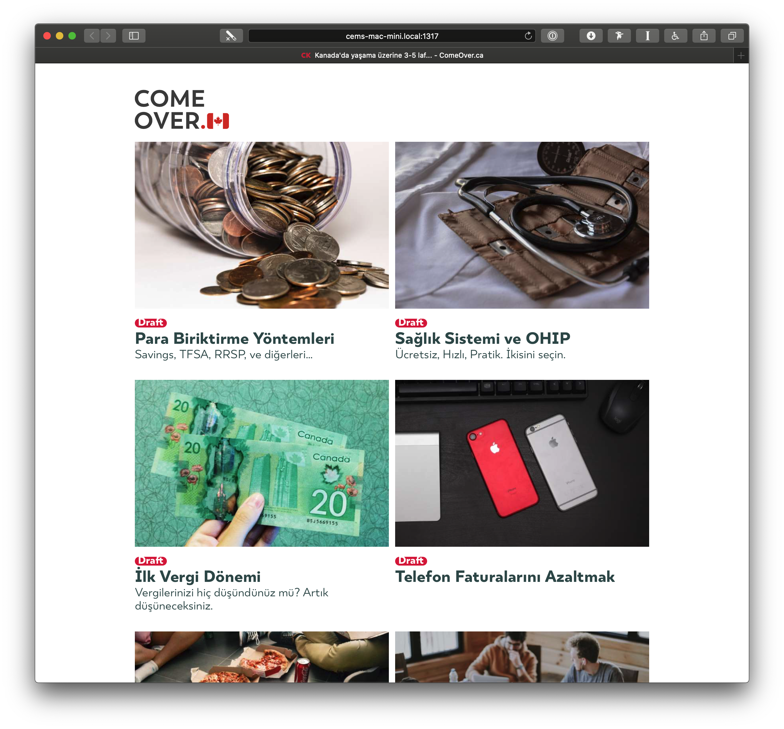
The app was only a part of my plan. The other half consisted of a guide, a conversion of my diary and notes of Canada (and Toronto) into a knowledgebase of sorts.
Everything you need to know to comfortably make this place your home. From opening a bank account, to getting your drivers license. Anything that could be taken granted for, unless you’ve ever been here before.

I’ve helped numerous friends—old and new—to either start over here from scratch, or get things done after they’ve started settling. We’ve also had help from numerous others, and it only made sense to have this online, as part of this effort—as a companion, a discovery avenue, and perhaps even a revenue stream.
Part 4: The Unknown (and the End)
This is the point where one truly feels that “life comes at you fast.”
I put in a lot of thought into this app. The frontend. The backend. The privacy vector. The planning of technical details. The planning of social details. Family accounts. The knowledgebase. Discounts. Non-invasive monetization techniques. The whole nine yards.
With everything happening around, by the time I’m ready to push this to the App Store, it’ll be obsolete.
While the app is not completely useless at this point, all the time and effort I put into the calculations are, or will be, off. Currently no citizenship services are provided, for example. Landings are handled remotely. This will also surely affect new rules and regulations over Express Entry applications and PR card renewals.
Besides that, daily life has also turned upside down. More than half of my knowledgebase tutorials are invalid now. There is no guidance I can provide, because it’s truly unprecedented and we’re all learning to cope with it as we live through it.
That is why, I’ve decided not to launch this product at this time.
That doesn’t mean it’s the end.
I’m still using the codebase for myself. (Not that I expect any new data entries for quite a while.)
Maybe when3 we return back to life-as-we-know-it, I can dust it off and give it a final shove out the door, and it’ll still be useful. Maybe it’ll be sooner rather than later, and might not even need too much of a change.
One can hope.