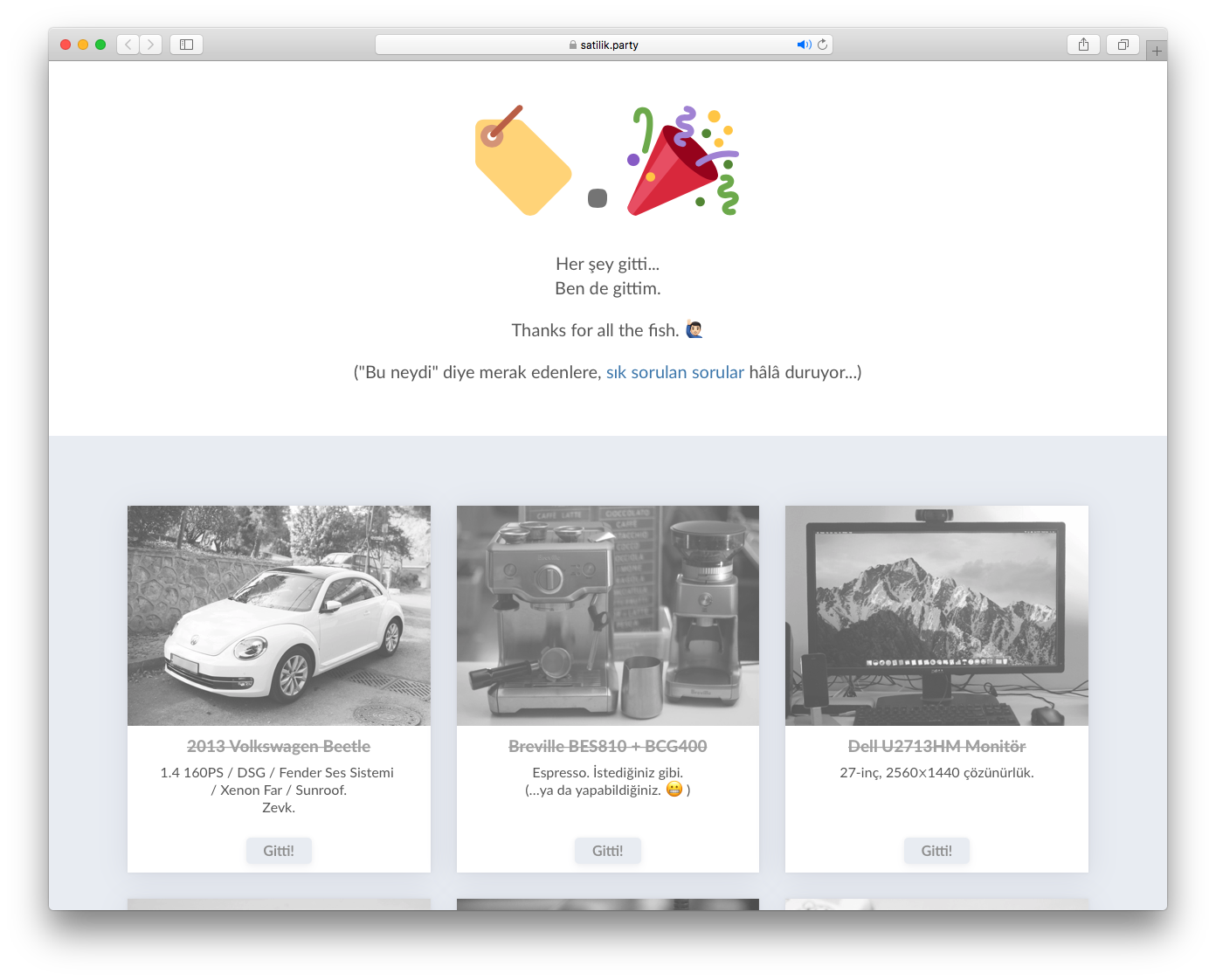
Selling things; going home.
I have moved enough to know that it costs an arm and a leg to move all your belongings with you. So, for my first-ever transoceanic1 move, I decided to sell everything but my clothes and my computer.
In hindsight, I might have just made up an excuse to try out CSS Grids.
The Move
In August, I bought my Toronto ticket for mid-November, and decided to close my house before October ends. That gave me 2 weeks at my parents house, and about 2 months to sift through all the things I could and couldn’t fit into my old room.
Thankfully, I had decided to downsize long before I had decided to move to Toronto. Dustin Curtis’s “The Best” explains my reasoning regarding my belongings. They have to2 serve a purpose and be resilient to be owned over a certain amount of time. So there were many things I owned, but not a whole lot than is necessary.
The Sale
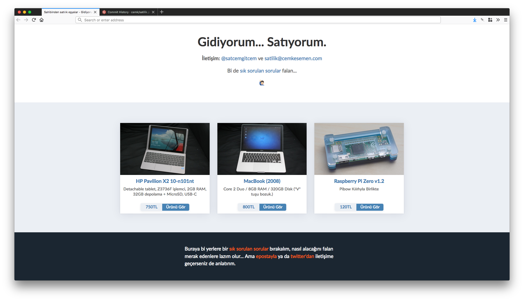
Using services like LetGo or Kijiji’s local alternatives would not have worked at this scale. I wanted my own space to list everything, because I would be selling a few specialized stuff. I wanted to personalize it, track it, and make a project out of it. I wanted it to be a blog at the same time.
I remembered that Ben Brooks did a similar thing way back when; he had the domain oldstuff.forsale and he sold stuff he reviewed. That became my inspiration for the whole operation.
The Site
Unlike Brooks, I did not want to use Shopify. It would have been an overkill; I did not need any of the backend features Shopify would provide me, such as payment processing and basket management. All I needed was a CMS to list items, and this seemed like a perfect opportunity to try out Hugo.
The Hugo
Hugo has a very steep learning curve. Especially if you are creating your own designs, you need to visit multiple documentation pages multiple times to wrap your head around it.
I created a simple theme for it (found out later that I did not need to), created a footer and header partial template (which has a better workaround with later versions), wrote a partial template for item cards, and the layout for the item details page. The site effectively uses 3 views; one for the listing, one for the product page, and one for an FAQ page.
The CSS Grid Layout
I knew I wanted to make this with CSS Grids. Because I always had issues with Bootstrap and this seemed way too convenient not to learn.
Granted, I did not use it the right way. I still used media-queries to change the layout, instead of minmax’ing and auto-fit’ing the cards. But still, I got items to be ordered and aligned just the way I hoped to, with the added help of CSS Grids’ cousin, Flexbox.
The Product Page Layout
I wanted to write a brief description, and put a few photos on the page. I did not want to put a carousel or hide photos behind clicks, so I decided to go for a layout that shows all photos openly, with a description to go with it.
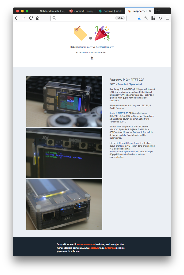
I used another CSS Grid trick for the page layout. Normally the description part comes before the photos, but I used grid-template-areas to make images come first on larger screen sizes, making images a bigger focus on adequate screen sizes yet not pushing descriptions to the bottom on mobile devices.
The Purchase Intent Interaction
Like I said, I did not use Shopify or anything else as a backend. This was a static site, so how would users be buying things?
Email and Twitter, of course.
I created two links, one Twitter Web Intents link, and one mailto: link. The Twitter Web Intents link automatically inserted the product page URL into a tweet, and the mail link inserted the product name into the subject, so the person who wanted to buy the stuff did not have to deal with describing the product they were interested in.
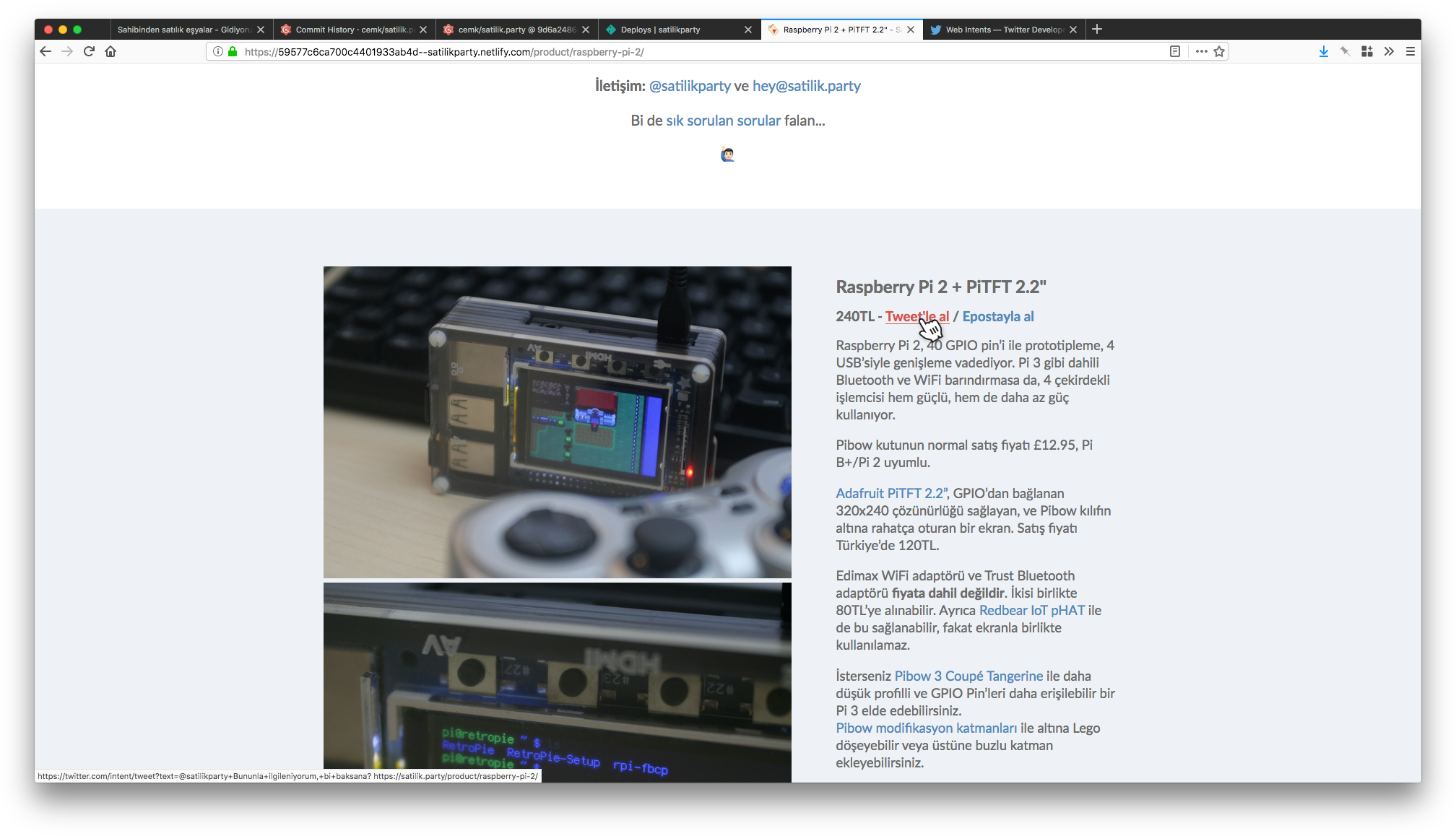
I wanted to have both options, because I simply was not sure which one would be more convenient in the absence of a regular checkout process. There might be people who would rather not expose their email address to some stranger, but then again, there might be people who do not want to make their intention to purchase an item public either…
Turns out, I was right to go with both options; I made half of my sales from Twitter, and half by email contacts.
The Name
Namecheap has really cheap domains for sale: $0.48 for a year, and $5.58 for 5 years. The options are not that refreshing; .bid or .trade came close to what I intended to do, but was not quite there. .faith and .cricket probably would not have worked any better.
Then one TLD caught my eye: .party 🎉
My mind went through a thousand options in a few seconds and settled on satilik.party; The word “satilik” means “for sale” in Turkish, and well, “party” is “parti”.
I assumed the playful name would help with the reach too. It is catchy, memorable, and intriguing enough to at least warrant a click when mentioned somewhere.
I got the domain name for 5 years, due to an unwarranted fear that a full year would not be enough to sell away everything and I’d have to renew at $26 the very next year.
The Hosting
I used Netlify for the hosting.
It was really easy to publish new items and changes. Type hugo to build the site and netlify deploy to upload changes. That’s it. Versioned and published.
It also does not hurt that it is free, though I certainly would not mind paying some money for the convenience.
Optimizing Things
Launching the site did not mean my job was done. Sure I listed some items, but there were a lot more to come, and I needed some additional work done to make it more efficient.
Product Images
I used my girlfriends very old 350D DSLR to take photos, but because I still had my Волна-9 lens, a few old flashes, and some Yongnuo remote triggers from my 5D Mark III kit, they turned out better than OK.
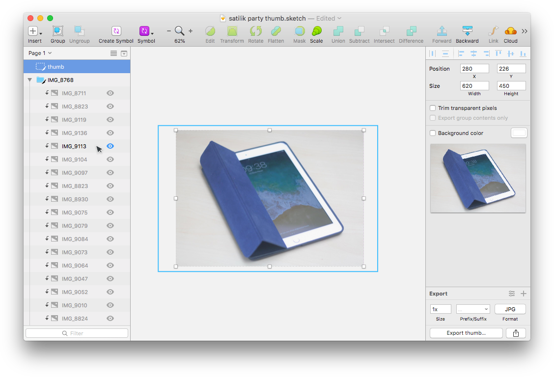
They still needed cropping and moving around to fit the thumbnail size I had selected, so they would be uniform on the listing page. The aspect ratio I chose was off, so I could not automate this process.
Sketch came to the rescue; I created a rectangle with my thumbnail size, to use as a mask, and laid a slice called “thumb” on top of it. I would then import images, resize on top of the mask to get the exact image I want, select the slice and export the final thumbnail as thumb.jpg.
Marking a Sale
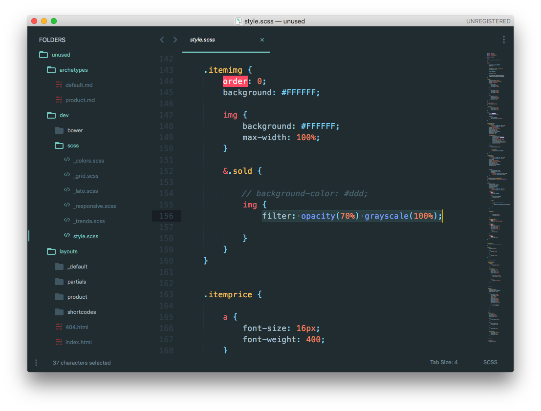
When I created the site I thought to myself, “I’ll just remove products that are sold.” Then I realized that the more products are sold, the more the site would seem empty. And sad. And pathetic. So I had to find another way.
I used the front matter of the product pages to create a boolean variable named sold, and marked it as “false” in the archetype. Every page created would get a “sold = false” variable in it, and I would just have to change it to “true” to mark it as sold.
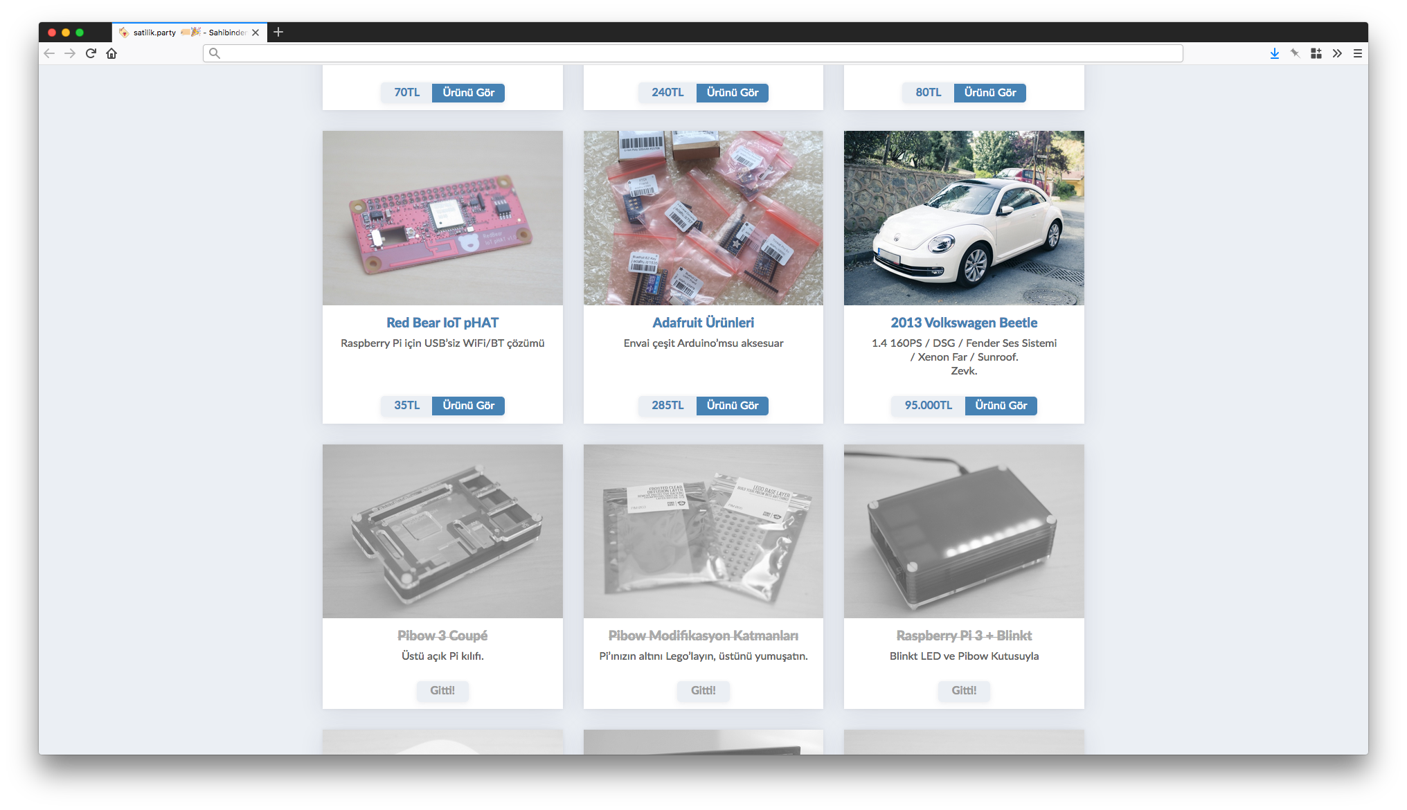
I then used conditionals to change a few styles and texts in item cards and product pages. I removed price information and the purchase intent links, and put a “Sold!” sign on every item that was gone.
Visualizing Sold Items
I wanted to make sure sold items were visually distinguished in the listing, less colorful than the other items.
I however did not want to re-create every image, and add a second thumbnail to the folder. So I added a class to items marked as sold, and made sure the thumbnail image inside that class got some CSS treatment to make it look faded.
Seeing visits
I had no idea if people were visiting the page. Sure I was being contacted from time to time, but I thought to myself, “it would be nice to see when someone’s on the page”.
I did not use Google Analytics, but I did use Clicky3. Clicky has an API that allows you to pull data, including visitors-online4.
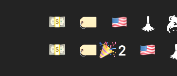
I use and love Bitbar, it is one of the few apps I truly admire. I wrote a custom Python script for it that grabs the number of online visitors from the API, and outputs emoji depending on the situation. If there is noone online, all I got was a bland sale tag emoji 🏷, but if someone was on the page, then we got a 🏷🎉 partay!
Selling in Bitcoin?
I like the geeky side of crypto-currencies, all the different wallets and platforms to try out is exciting. Also the fact that PayPal was recently shut down in Turkey made the possibility of an alternative & decentralized platform where you did not require governmental approval to receive payments definitely intriguing.
Then the insane value increase5 came and any practicality flew out the window.
I did not really want to sell in Bitcoin though… I actually wanted to try and show a BTC price of an item in realtime, in a static page. I knew I could use Vue.js to get some data, but I needed a place to generate that data.
I decided to give Glitch a proper try. I created a Flask app that gets TRY value of a BTC from the Coinbase API, then does some math to push out the BTC value of a given TRY amount: https://probable-teller.glitch.me/285
I then copied and edited some Vue.js code to make sure it shows up on the page, and sure enough it did.
I’ve added Vue-based realtime BTC conversion to my static @GoHugoIO site hosted on @netlify, using @glitch as an API gateway pic.twitter.com/9Tp2xNuAV4
— Cem Kesemen (@cemkesemen) August 8, 2017
This was the most fun part of the project.
And nope, not a single purchase was made with Bitcoin. 🤷🏻♂️
Sold Out

I did manage to ship off everything, but I did not sell all of them. I donated my Adafruit and Raspberry Pi bits to a school in the east that was trying to raise money for a maker lab. I also gifted my Lomography Spinner to someone, because it became a memento of a lost loved one.
However, I did learn about CSS Grids and Hugo, got to play around with Glitch and Vue.js, sold many things quicker than I could have done on any other platform; and it all cost me less than a Venti Latte at Starbucks.
Now I have this page to remind me of the brief time I spent in Turkey, and the things I owned there… until the domain runs out in 4 years.
-
Granted, I have had novelty purchases, small (like a home-grade espresso maker) and big (like a Volkswagen Beetle 🤦🏻♂️). ↩︎
-
Referral link. Sorry. ↩︎
-
Sample output for
visitors-online. ↩︎